

Your model provider's dashboard already tells you what you spent. It breaks that spend down by user and by API key, which says very little about the work itself. It can't tell you what a repo costs to work in, or what an average session costs, because a provider dashboard has no idea what a repo or a session is.
Polygraph does. Every session it records carries the repo it ran in, the person who ran it, and the agent and model behind it, so Account insights can group the same tokens by the things you actually plan around.
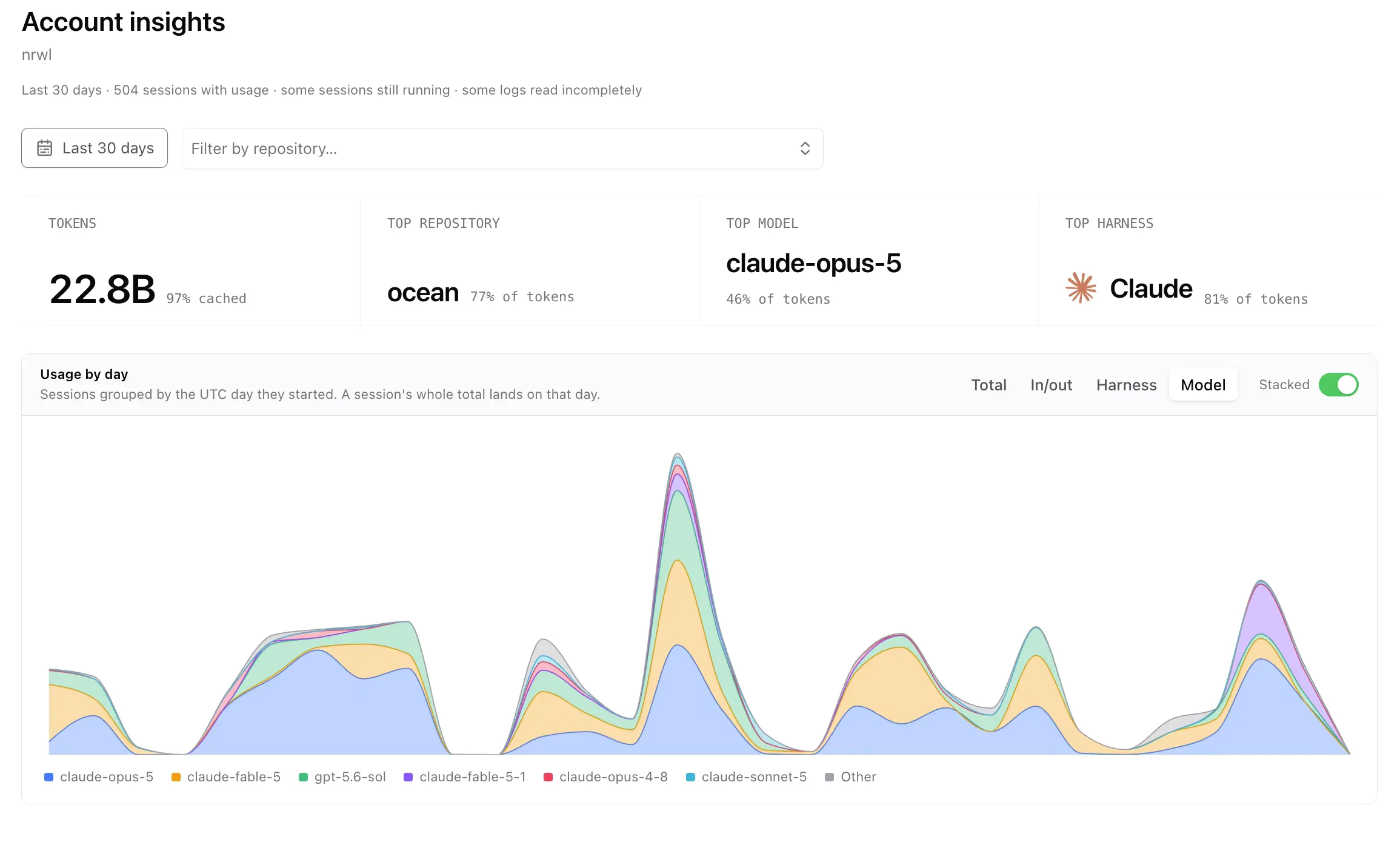
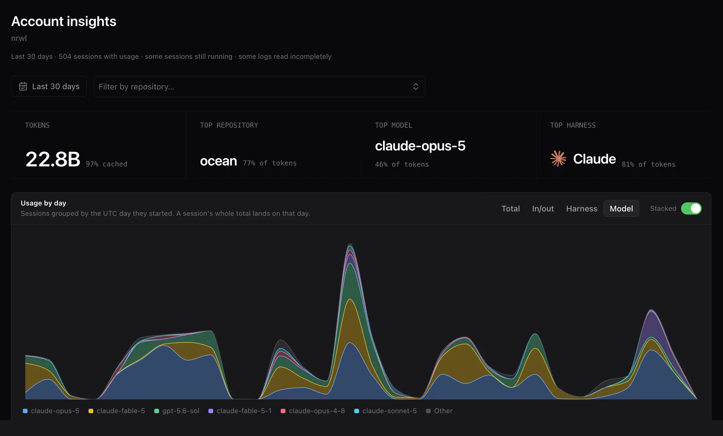
If you are an account admin, you can open the page from your account page with Insights.
You can filter the whole page to a custom time period (the last 30 days by default) and to a subset of repos.
Break daily usage down by model, harness, or token type
Section titled “Break daily usage down by model, harness, or token type”Usage by day starts as a single line covering every token in the window. Switching the split regroups the same data to answer a different question.
| Split | What each series is |
|---|---|
| Total | One series, every token in the window. |
| In/out | Cached input, input, output, and reasoning. |
| Harness | One series per coding agent: claude, codex, opencode. |
| Model | One series per model, the six heaviest, with the rest folded into Other. |
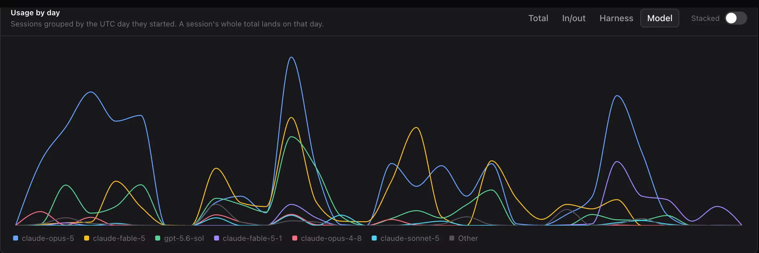
Lines are easier to read when you want to see which series is growing:
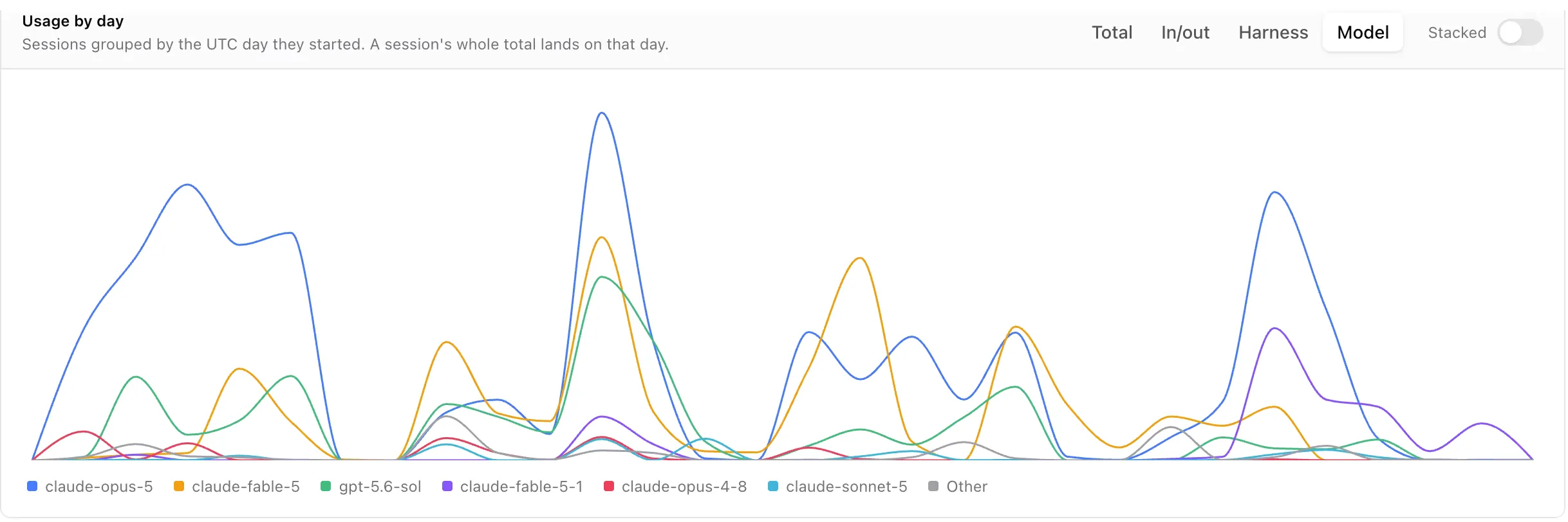
Turn on Stacked to draw the same split as stacked areas, which is better when you want to know what a particular day was made of:
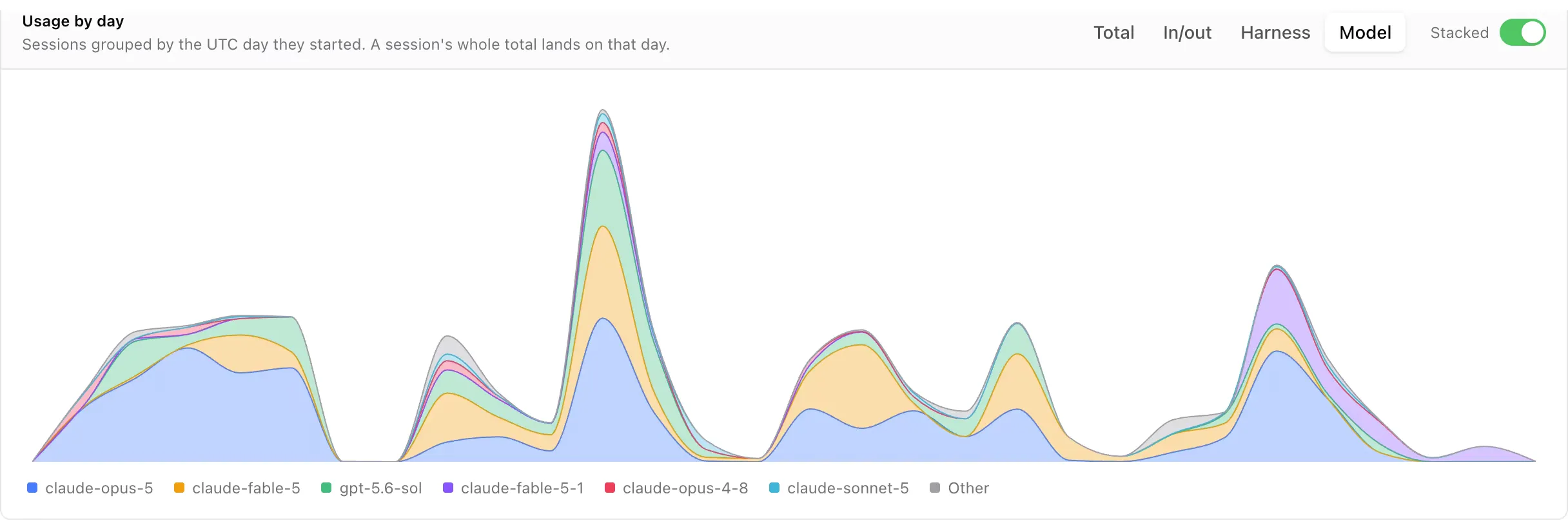
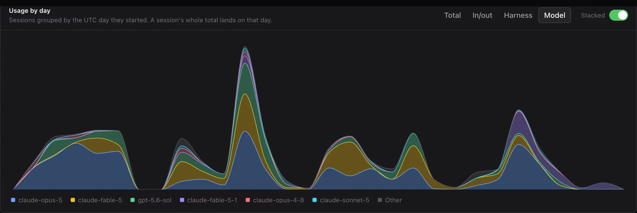
Each session counts entirely on the UTC day it started, so a session that begins on Monday evening and runs past midnight lands on Monday.
Usage per person
Section titled “Usage per person”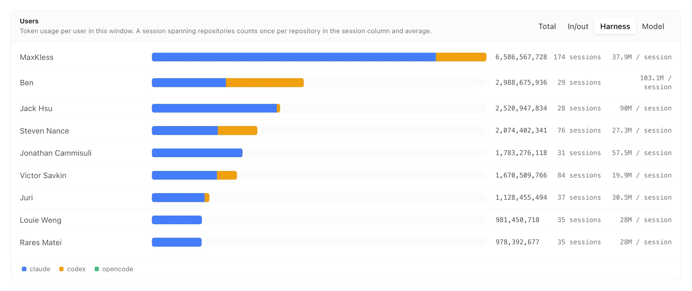
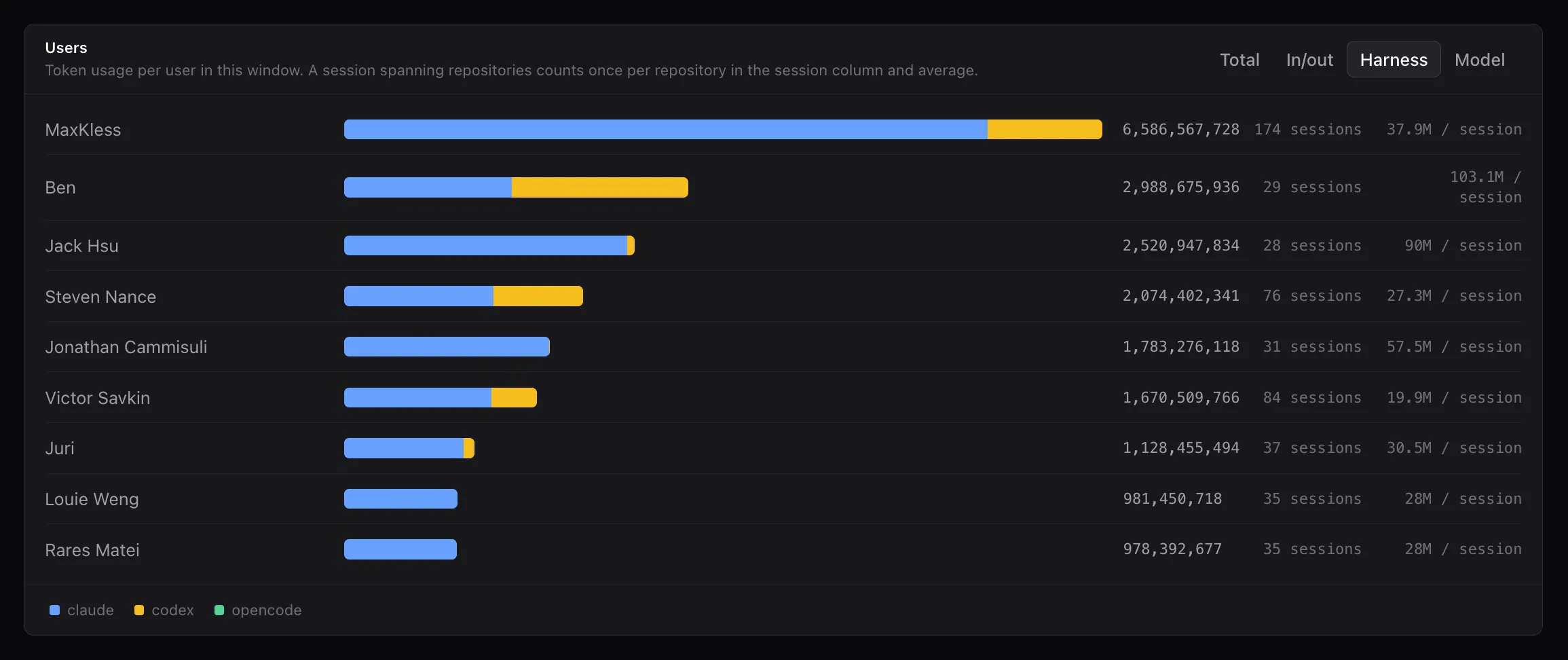
Users ranks the people in the account by tokens, and shows how many sessions produced that total along with the average tokens per session.
The average is usually more interesting than the total. Someone with a large total and a small average is running a lot of short sessions, and the opposite pattern means fewer but longer ones, which is worth knowing before you read a big number as overspending.
Usage per repository
Section titled “Usage per repository”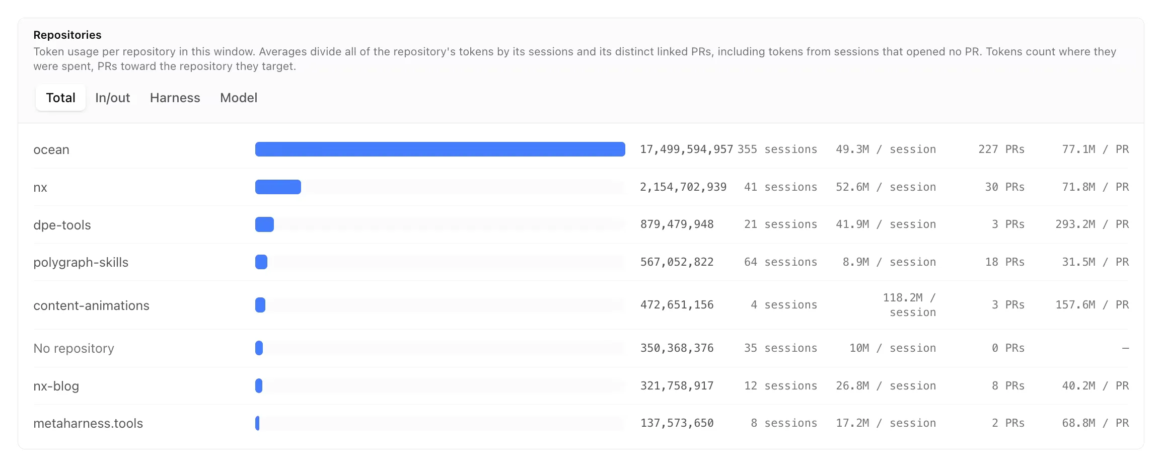
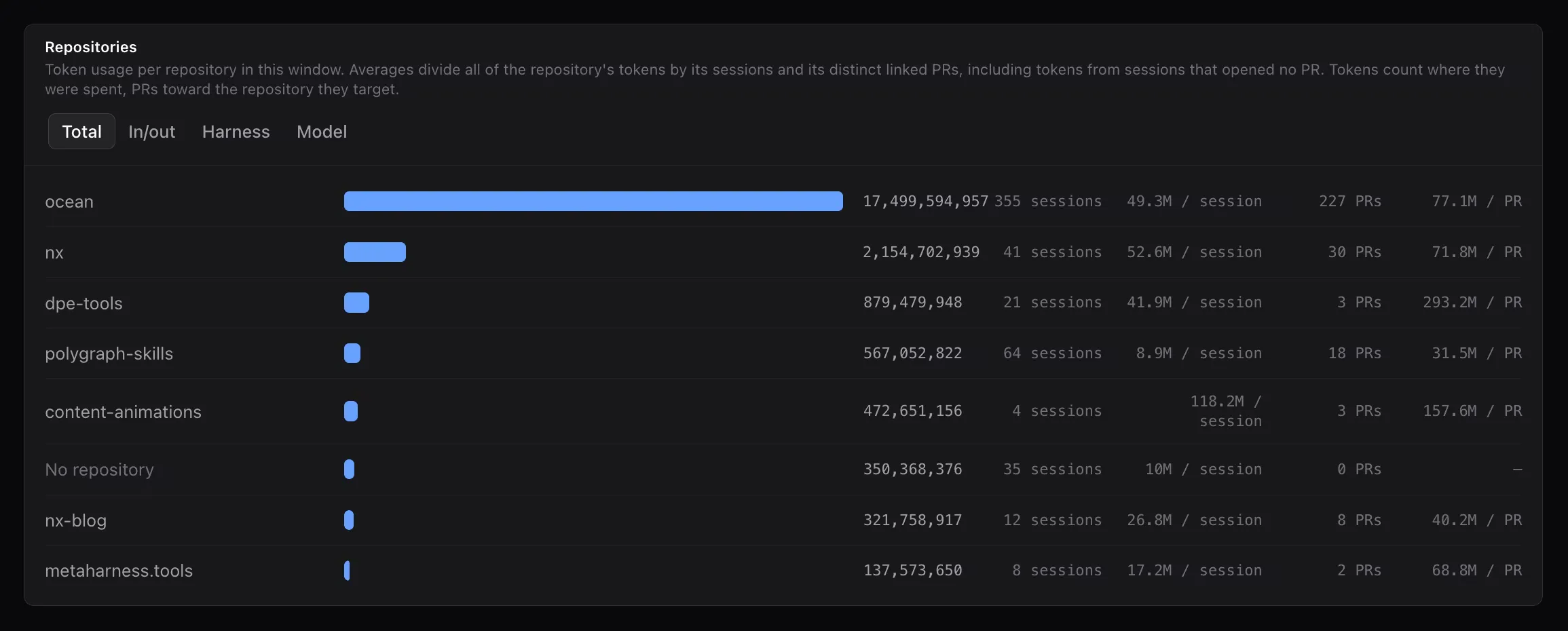
Repositories ranks repos the same way, and adds the pull requests linked in the window along with the average tokens per pull request.
Keep in mind that this average includes sessions that never opened a pull request, so a repo you mostly use for exploration looks more expensive per pull request than one where most sessions ship. Usage that could not be attributed to a repo is collected in the No repository row.
What counts as usage
Section titled “What counts as usage”- Sessions that ran through the Polygraph CLI or the Polygraph plugin, including every child agent they delegated to.
- Background work you never started a session for, as long as background session capture is toggled on for the account.
The numbers here are tokens rather than dollars, so turning them into money means applying your provider's per-model rates, which the model split gives you. Dollar tracking is coming and will do that conversion for you.
Coming soon: Semantic classification
Section titled “Coming soon: Semantic classification”Breakdowns per repo, person, and model are useful, but the question that usually follows is what kind of work is spending the most.
Polygraph already knows what each session was doing, from its description, its transcript, and the results it produced, so it can classify each one and count it later. Bug fixes, feature work, refactors, and one-off code questions each become another way to split the same totals.
That answers the question teams actually ask: what a fix costs next to what a feature costs, whether either is climbing, and which repos spend more on repair than on new work. The classification runs over the sessions you have already recorded, so the answer covers your history instead of starting from the day it ships.